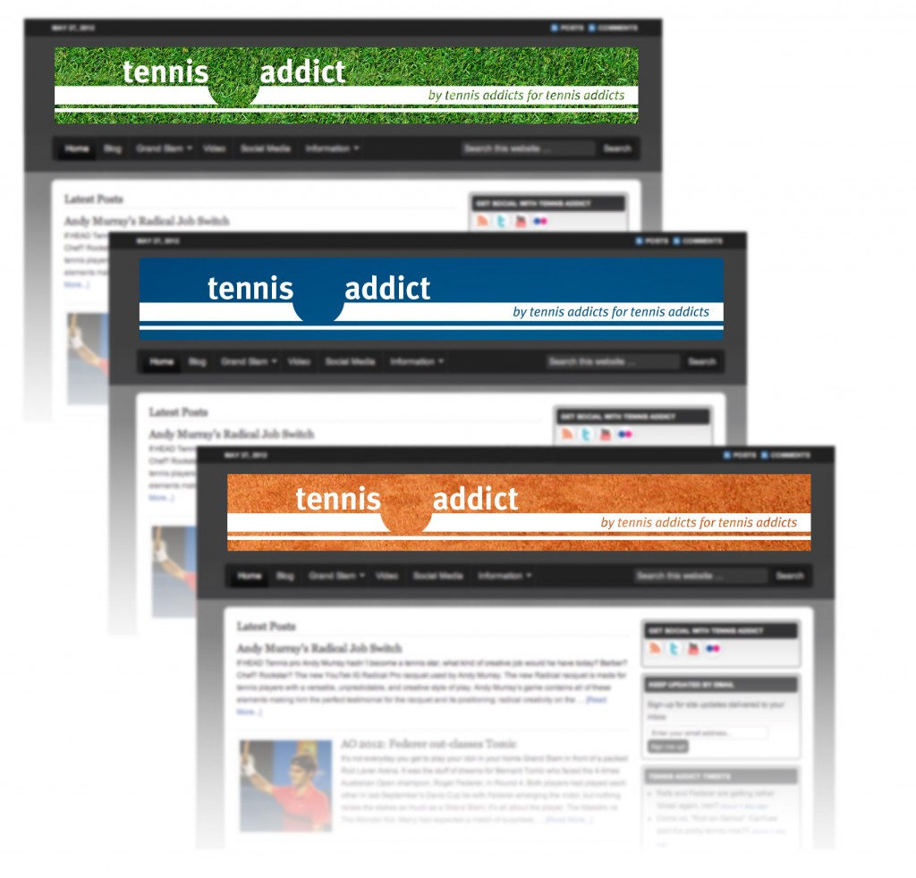
Here’s my new logo for tennisaddict.net – a soon-to-be-launched site devoted to… well, I think you can guess.
There are two formats. A stacked version for watermarking photographs and a horizontal version for use as a banner on the website itself. The three different colours behind it represent the different surfaces – and seasons – of the tennis year.
And here’s one that didn’t make the cut. I rather like it, but it is possibly a bit frivolous. Nice typeface though.


From my blog: A new logo for http://t.co/CC3xRCTR http://t.co/h9o3zA06
@robinhosking I already do keep my Mac spotless. Oh, and I blogged your logo: http://t.co/h9o3zA06